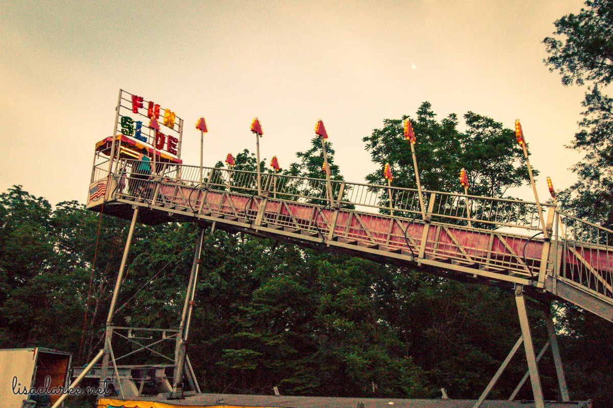
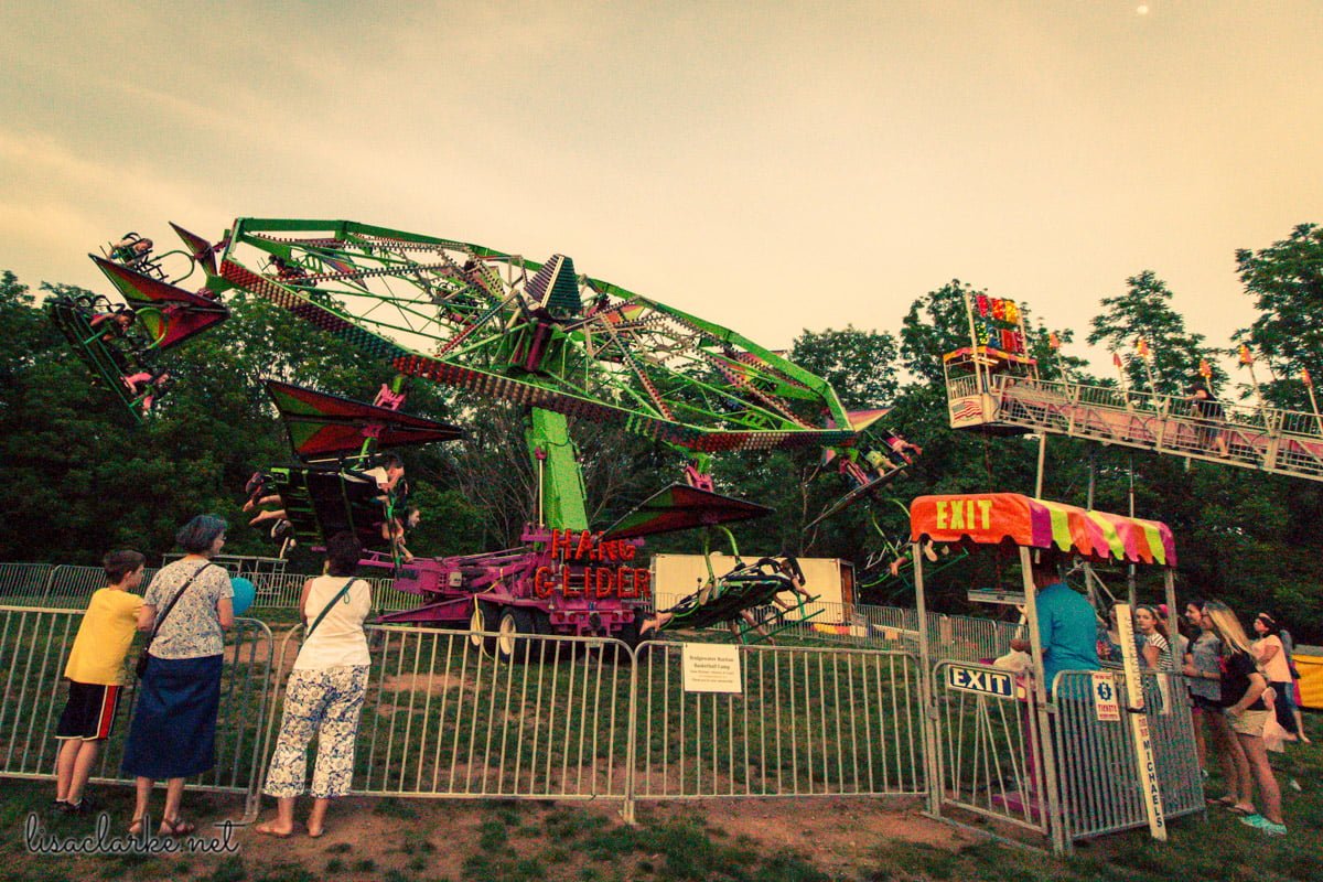
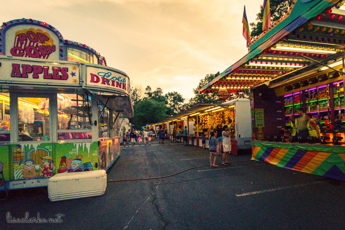
Last week, one of my kids was putting in some community service hours at our church’s carnival. My small brood is notorious for remaining unimpressed in the presence of amusement parks and such, but nevertheless I decided the rest of us were going, too. It would be good to get out of the house on a Friday night.
This was a surprisingly hard sell to the kid who hadn’t signed up to help and who had therefore planned to spend his Friday night hanging out with his online friends. I was willing to wheel and deal with him, though, and in the end I agreed to limit myself to one lap around the festivities and enough time to take a decent Project 365 photo, and he agreed to get in the car with less complaining than usual.

As often happens once I actually get the kid out of the house, he did not have a terrible time. In fact, I was granted an additional lap or two, as well as time for more picture-taking. We even enjoyed some vanilla soft serve with rainbow sprinkles. Win!
When I got home and looked at the images I had captured, I discovered an unhappy fact: I had left my camera’s ISO cranked up to 6400. #facepalm
Understanding ISO and Exposure
ISO on a digital camera, if you don’t know, is akin to film speed when you are using a film camera. Back in the day, if you were taking mainly outdoor shots, you’d buy 100 speed film. If you were going to be indoors, 400 speed was a better choice.
The Exposure Triangle
When you are taking a picture, the camera needs light in order to record the image. This light is controlled through three settings: aperture, shutter speed, and ISO.
Each of these settings, in order to let in the most light, has a trade-off:
- Aperture determines how much of your image is in focus. The wider the aperture the more light that flows in and the less of your image that is in focus. Depending on your point of view, this is either a pro or a con. I happen to like dreamy out-of-focus backgrounds, and so a wide aperture is my favorite way to let in the light. However, if I were shooting landscapes where everything needed to be in focus, I wouldn’t want my aperture to be wide open.
- Shutter speed determines how long the shutter is open. The longer the shutter speed the more light that flows in and the higher the potential for camera shake. Unless you have a tripod or other way of stabilizing the camera, a slow shutter speed is not a desirable way of letting in the light. (On the other hand, if you do have a tripod, you can get some really amazing shots by leaving your shutter open for a while.)
- ISO determines the camera’s sensitivity to light. The higher the ISO the more sensitive the camera and the more noise (speckles, grain) that is introduced to the resulting image. High ISO is handy when you need to get the shot and cannot get enough light through the previous two settings. I consider it a last-resort option, and frankly don’t expect to use any of the resulting images for anything other than personal use. I keep my camera set to ISO 100 as often as possible.
My Mistake
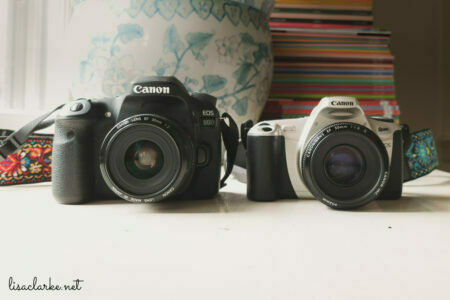
Some modern cameras are really amazing at higher ISOs. Mine, not so much. It’s only 4 years old, but from what I’ve read, great strides in ISO-to-noise ratio have been made in that time.

So Friday night at the carnival it was early enough in the evening that there was still plenty of ambient light. If I had bothered to check my ISO, I’d have probably settled on 400 or so, and been on my merry way.
Unfortunately, I forgot to even look at it. I’d had one of those last-resort situations earlier and had set my ISO to 6400 and never put it back.
All of my images came out of the camera grainy and noisy as all get-out. They were kind of awful.
I kept flipping through them, hoping to find at least one that could be saved as a 365 image, and the more I looked at them, the more they had kind of a vintage vibe to me. They made me think of old photos from the 70’s that had been sitting around in a drawer, getting faded.
The digital noise reminded me a bit of film grain, and so I decided to go with it and really play-up the old feel.
Grainy Vintage Photo Processing
I made my adjustments in Lightroom, but you could use any photo editing software for something like this. The beauty of making an image look like an old photo is that you don’t have to be too concerned about perfect processing. A free tool like Google’s Picasa is fine.
When you are trying to make an image look old and faded, you are looking to manipulate the shadows and the highlights of the photo. The blacks should not be truly black and the whites should not be truly white. On some old photos the black fades to purple, and on others it’s red or maybe even green. The whites tend to warm up and become yellowed. I gave these photos a few different treatments, but for the most part, I tinted the shadows purple or red and tinted the highlights yellow. You can use your artistic eye to decide what looks best for your image.
There are a lot of ways to do this, but here are a few specific examples for different kinds of photo-editing software.
Lightroom
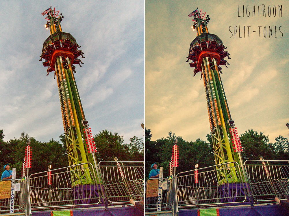
In Lightroom, you can use the Split Toning sliders. For nearly all of the photos in this post I used the following Split Tone settings:
- Highlights: Hue 50, Saturation 100
- Balance: 0
- Shadows: Hue 225, Saturation 50
Photoshop
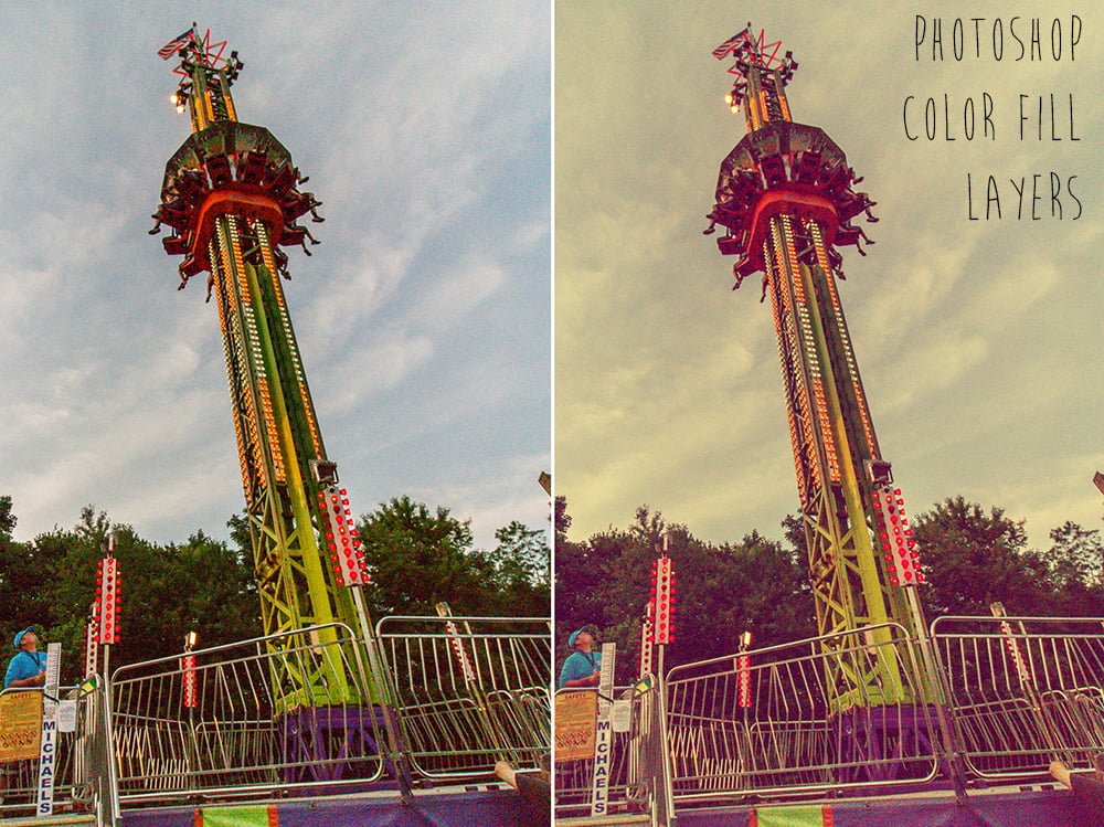
My favorite way to do this in Photoshop is with Color Fill Layers:
- Add a Purple (#400040) color fill and give it a blend mode of “screen.” This will give the dark portions of the image a purplish tint.
- Add a Yellow (#ffff80) color fill and give it a blend mode of “multiply.” This will give the light portions of the image a yellowish tint.
- Adjust the opacity of the layers to taste. I used 75% here.
Picasa
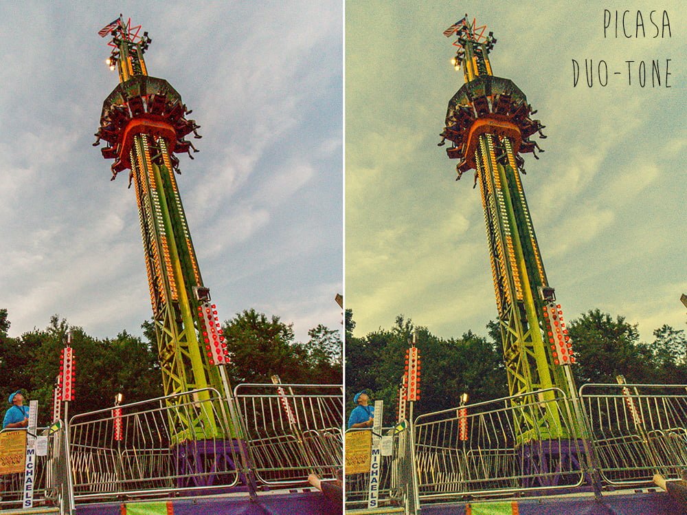
Picasa has a Duo-Tone filter you can add. The default behavior turns the image entirely Blue (shadows) and Yellow (highlights) but you can use the color picker to change these two colors, and you can use the Fade slider to minimize the effect. In this example, I used the default colors and pushed the slider about 75% of the way to the right.
There are so many other ways to add vintagey effects to photos and I can’t begin to cover them in one post. My main point here is that a botched camera setting doesn’t have to result in garbage photos. You can use it as an opportunity for some creative play.
These images are so unbearably noisy that they will never be considered classically good photos. But now that I have used their weaknesses to my advantage, I can pretend that “I meant to do that” if I want to and enjoy them as a bit of artsy fun and snapshots of our evening out.
Oh, and I can also enjoy them as reminders to check my camera settings before my next adventure!
New as of July, 2018: You can purchase some of my Photoshop Actions and Lightroom Presets, including some vintagey split tone effects!