

We’ve taken every other step, and all that remains is to give our new color scheme a name. I’ve had a lot of fun looking through your submissions, your comments to me, and your comments to each other. I had a small list of favorites going all week, but one of the later entries jumped out at me. And so, without further ado, I present…
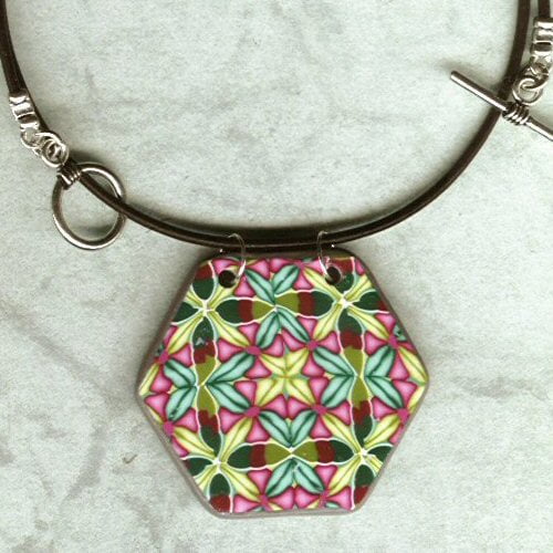
The Crabapple Color Scheme! Congratulations to Mindy, who had the winning entry! Email me, Mindy, and let me know whether you’d like the DVD or the buttons as your prize.


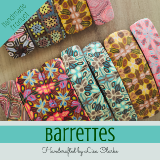
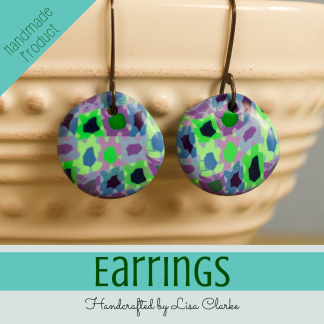
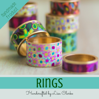
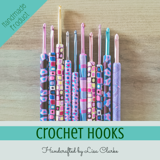
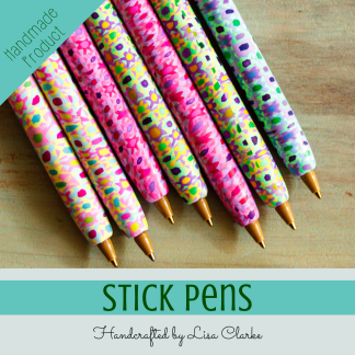
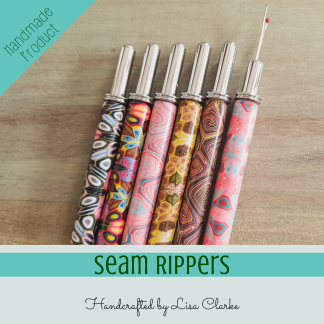
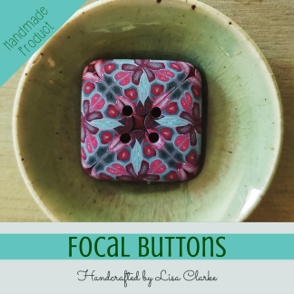
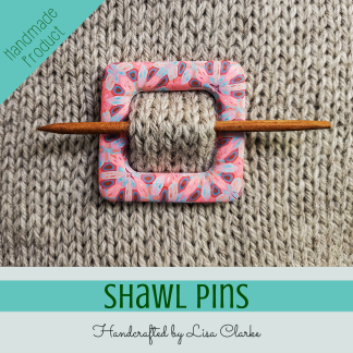
The Crabapple Collection is now open for business, if any of you are in a shopping kind of mood…
Some of the other names to make it to my short list, in case you are curious:
- Peony
- Rainforest
- Harlequin
- Posy
- Cranberry
- Waterlily
- Sweatpea
- Passionfruit
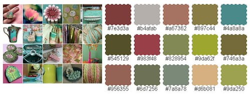
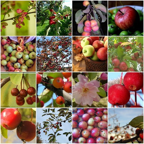
This has been an interesting series for me. I’ve never built a color scheme this way before. In the end, those three colors I picked to use don’t stand out as much as I’d expected them to. They blend together and form new hues. What is ironic is that those blended hues ended up being very similar to the colors chosen by one of the palette generators we used in Step One. Colors I initially rejected for not being true enough to the mosaic. Maybe the computer program knows something I don’t, eh?


The pendant is amazing, and I love the name you chose!
Thank you! And I’m happy with that name, too.
Way to go Mindy!!…and Lisa that is the perfect name for your newest collection!…describes the colors from the blossoms, leaves, all the way to the fruit!!…and the pendant is very pretty as well!!… 🙂
I agree – the name jumped out at me right away. Thank you for the complement – I don’t make a lot of those kaleidoscopic hexagons, but I should because they always sell well.
YAYYYYYYYYYYYY….I won, I won, I won! I’m not sure how you did it Lisa — there were SO many good names in there. Thanks so much! This was fun, now we need something else to name! BTW, what was the name YOU had originally had in our brain for it, or are you keeping that a secret? thanks again…. nice chatting and teasing with you all through this!
Yes, it WAS tough, and some of those names, while not perfect for this collection gave me ideas for future collections. I’m filing them away for future use.
Pomegranate 🙂
I had a lot of fun with this, too – it’s not always this wacky around here, but I hope everyone who enjoyed chatting will stick around and keep the community atmosphere fun and friendly!
Great name and I was surprised to see one of my suggestions on the short list! Congrats, Mindy.
Yep, I was taken in by the fruity themes this time around!
Congratulations Mindy! When something is right its just right. Great name.
And one of my names made it to the short list too. Yay! 🙂
Well done Lisa, another beautiful collection.
debsx
Thanks – this was fun! Thanks for participating!
Love the choice, Lisa, and great job, Mindy! It’s a gorgeous color scheme and your work is fantastic, Lisa. I sure wish I were a decent caner…I think the DVD wouldn’t have helped enough; I need you to come to my house for a week for individual training. LOL
Looking forward to future color naming!
LOL, I’ll drop you a line next time I feel the need to escape my life for a week 😉 In the meantime, I really think it’s a matter of practice. And finding your niche. I can’t cane faces or things that are supposed to resemble other things worth a darn, but I make a pretty mean faux textile.
[…] all of the excitement of two contests coming to a close last week beefed up my readership a bit, and instead of riding that wave […]
This was so much fun to read Lisa, thank you for sharing your process!
Glad you enjoyed it! Thanks for the mention on craftgossip.