

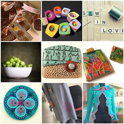
Looks like I’ve had thoughts of wearable-art dancing in my head this week. And maybe a little bit of food, too… I love Nikki‘s pumpkin bread teacher gifts. She put me to shame this year. (That’s not hard to do, since I actually never got around to making any bread or gifting it. I’m such a slacker this year.)
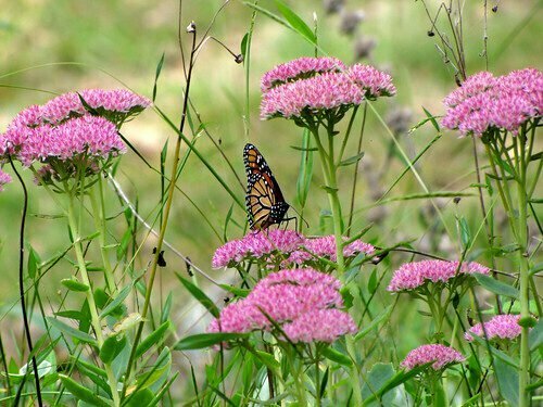
As for my own favorite photo, I was lucky to capture a couple of shots of this butterfly who visited my back yard this week, but I think I like this one the best. This photo is one case where a small amount of post-processing goes a long way. You can hover your cursor over the image to see what it looked like SOOC (straight out of the camera).
I used only two tools in Paint Shop Pro:
- Color Balance: Temperature toward “warmer” (4600), Tint toward “more green” (10)
- Curves: Pressed the “contrast” button and let the software figure out the ideal setting.
I take these steps with virtually every photo I take. Sometimes they don’t look right and I have to try something else, and other times I’m going for a more “artsy” effect. But for the vast majority of my “everyday photos,” these are the only two steps necessary. They don’t always produce such dramatic results, but they usually have some benefit.
Happy Photo Friday!


WOW! I can’t believe the difference in the two butterfly photos! Not only the colors, but it really sharpened all the details beautifully.
I know! It must be the Curves adjustment that does that – it’s my new favorite tool.
Beautiful pictures as usual Lisa! Great Butterfly shot! This week a Dragonfly landed on a branch just a few inches from my face. What a delight! Wished so badly I could get my camera and take a photo but as soon as I moved, it flew away. 🙁
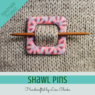
That frilly blue and pink sweater/jacket is so pretty. I picture myself looking wonderful in it. (Whether or not it would actually look good on me, would take trying it on. But in my mind it fits perfectly!)
I do that “trying things on in my mind” all the the time. Only problem is that the me in my mind is a size 6, and the me in real life is, uh, not. 😀 The imaginary me has a really fabulous wardrobe!
Wow, beautiful picture! Those few adjustments made such a difference.
Thank you – it sometimes surprises me how dramatic those two little changes can be!