
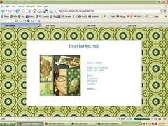
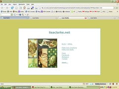
As long as I’m asking questions, how about this one? I could use some opinions regarding my personal website’s background. (Click on the images to see how they each look in actual size)


[poll=3]
Thanks so much for your input! I know what I like, but I could use some objective opinions, especially from people who may be using different types of browsers or computer screens than I am. If you have any further observations, feel free to leave them in the comments.
What would I do without you to bounce these things off of? 🙂


The top two take away from your images, the bottom two are better with the solid color being my favorite….just because you notice your art work and your eye isn’t drawn from it.
I vote for the solid color also. It’s the only color that doesn’t compete with your images.
I like Option 1. I think it has more Pizzazz ;>) I’ve been noticing more blogs with patterned backgrounds. They really stand out from all the rest!
Lisa: I don’t think your vote thingy is working. I couldn’t get it to go through.
I am not sure my vote through either. I picked #3
I like number 1, it makes everything pop.
I vote for number three. The other two patterns are too big and too busy and the solid color is kind of blah (for me, anyway)….
I like the first one. I think it makes the page most interesting and appealing.
Although the pattern is large, I think it doesn’t hide the text. On the contrary, it makes the solid rectangle with the text stand out more clearly and distinctly.
How about a solid color from the bottom two and then a nice fat stripe somewhere on the page made up of one of the patterns (I can’t decide about vertical or horizontal, I am thinking vertical, though). I really like the patterns, but think less might be more in this case. Or, you could do a box around the central image/content that is solid (one of your complementary colors on the bottom, not white) and then leave the patterned background up.
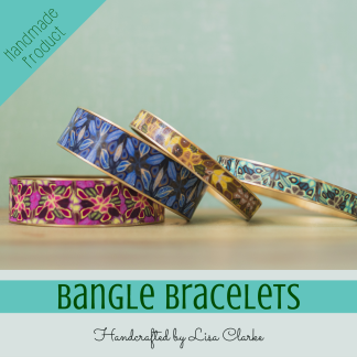
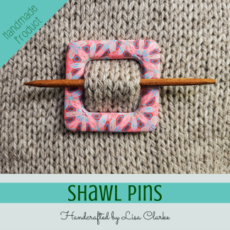
See what Lisa has been blogging about: Woolgirl is beyond awesome!
I like the fourth.
Lisa, I guess the vote machine is not working. I vote for number 2 🙂
Hm. . . For a pattern, I’d vote for number 2, but I agree that the solid might be less distracting from the actual content.
Then again, once you’ve seen a background for a while– even if it is a bold pattern– it probably “fades” away somewhat. Especially compared to when you’re actively comparing different backgrounds. ;o)
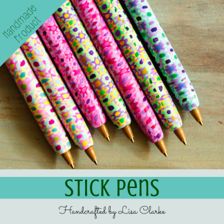
See what Michael has been blogging about: Handmade Texture Tools
My vote is for -Image 2- It has the perfect balance.
Image 3 – Tiny Pattern
I vote for #1. I think it pops and it all ties together!
I couldn’t figure out how to vote, but I picked image number 1. I love big and bold : D
I REALLY like the 1st one! I think the pattern ties in very well with the pictures.
Vote isn’t working for me either but I love # 1
I like number 2. I think it is not too busy but it gives a little pop to it.
At first I liked image 2 best but now I am undecided again – I kinda like the solid one too. I do think you need a banner across the top to kind of balance it out – you seem to be floating in the middle and it is distracting 🙂
I like the Image 2 pattern a lot but I agree that the solid color is probably a better choice to show your work. I like more of a blue in the green color than yellow though.
I like the second one, the middle stands out more.
In order:
2, 1, 3, 4
The solid color really doesn’t look great on my screen; it’s as if the color is *just off.*
For what it’s worth, I’m viewing in Firefox on a Mac.
I checked it out in Safari, too, and 2 and 1 might switch places there, but I don’t think so. Still don’t love the solid color, which is probably more about my monitor than about your color choice.
I’m having trouble with the voting button, but my choices in order are: 2, 3, 1, 4. Number one is just a bit too much, number four is too plain — I like the color, and I like simple, but somehow it just doesn’t work.
I like #1. It appeals to me the most. As it has been pointed out already, the poll isn’t working.
#1 – it has good energy – kind of like what I imagine your energy is like!
Pattern 1 is interesting visually, but overpowers the central image.
Pattern 3 has enough visual interest without being overpowering.
Go Threeeeeeeee
cheers
Greer
I like the contrast of number 1, although I love the colors of number 2. I tried to vote, but it wouldn’t finish.
Number 1.~~Dee
I like #1 the best. I’m not sure why, but it feels more “right”.
They all seem to work… I originally thought #4, but actually now like #2. The contrasts in the pattern aren’t as huge as in #1, but it looks less ‘busy’ than #3 (if that makes sense).
They all score a big YUM, whichever one you choose.
I like the second example best. It has an interesting pattern, but isn’t too busy nor too plain. It shows off the real focus of the central grouping. I also love all the colors you selected in the backgrounds, but that’s because I love greens and blue-greens as found in trees and oceans.
Number 2! It has just the right amount of pizzazz.