
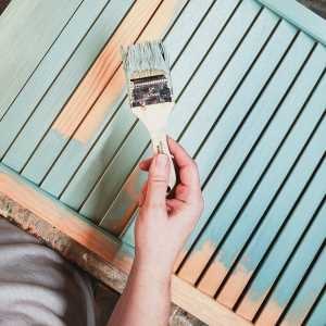

I thought it was supposed to be 90 degrees and sunny today. I dressed for it. Instead it’s 70 degrees and raining. And I’m desperate for chocolate. I need a bag of Kissables. Need it. I remember shopping on rainy days as a teenager, thinking my mom was weird for driving around the parking lot in search of a better space just to avoid getting too wet on the way in. “What’s the big deal? It’s just a little rain,” I would say. And now, 20 years later, here I sit, avoiding a trip to the supermarket because it’s drizzling. It’s not even pouring. I could understand being grounded by an all-out thunderstorm, but this? This is the kind of rain I used to go out in on purpose. Either I’m using the rain as an excuse for my laziness, or I really am as much like my mother as they say I am…
With rain comes mud, and with mud comes this interesting post I found on the Creative Catalyst Productions blog. Oil painter Caroline Jasper believes that color mixing should be avoided. The idea is that the most vibrant colors you can get are straight from the tube (or package, in the case of polymer clay). Every bit of foreign color you add to the base “muddies” it up somewhat. So, instead of mixing blue and yellow to make green, use the pure blue and the pure yellow in close proximity to each other. Your eye will still see the green, but the vibrancy of the blue and the yellow will not be lost.
 I have never seen this idea put into words before, although I have observed it in action. This Swamp color scheme consists of light blue, olive green, and dark brown, yet my eye often combines the green and blue so that I feel like I am looking at aqua. When I think about this color family, I very often envision it as brown and aqua. I actually use straight-from-the-package colors as often as possible in my work. There’s an obvious benefit to that approach – I don’t have to mix a new batch of “Custom Color A” every time I want to make a new cane in that scheme. But what makes a shortcut like that acceptable is the fact that the three base colors are rarely visible by themselves. I rely on those colors mingling with white and with each other in such a way that your eye sees more than three basic hues. And unless you are intimately familiar with the Sculpey III color chart, it’s not likely you would recognize the Candy color scheme as being Dusty Rose, Sweet Potato and Granny Smith-based, anyway.
Another mud-related concept I read about recently had to do with value and saturation contrast. Maggie Maggio is posting a fascinating series of articles on color-blindness. In discussing the task of designing street maps for those who cannot discern the difference between certain colors, the point is made that the contrast between hues is not nearly as important as the contrast between values. A color-blind person may not be able to tell the difference between light pink and light green, but he will be able to tell that light pink and dark green are distinct. This is a concept that does not only apply to the color-blind. The more value contrast in a cane design, for example, the less muddy the reduced result is and the more definition it has. This makes for a more appealing pattern.
 I’ve seen this in action with the ubiquitous Retro Cane. This is one of those designs that is so busy when reduced to a small size that you run the risk of losing the pattern entirely if your colors are all of the same brightness. My rule of thumb is to start with three dark colors and one light color (usually white). I create three medium colors by adding the light to the darks in equal portions. As I load the extruder, I alternate dark, medium, and light so that the concentric circles will emerge in a pattern with some contrast to it. This approach nearly always produces an appealing design. If you look at the image, you can see that the tiles with the least definition are the ones where I used a light color other than white. In particular, the Tweed tile and the Vineyard tile are not as eye-popping because they were lightened with tan and gray, respectively.
I’ve been thinking a lot about color lately. Must be that approaching Color Challenge deadline doing it to me…
I think it’s time I put on some shoes and get myself that chocolate I wanted. If I wait too much longer, I’ll spoil my appetite for the gourmet supper I’ll be preparing tonight.
![]()
Gourmet supper. I slay me.


wow..great post Lisa and great links. It’s been raining here too..which is freeking a miracle 🙂 But go get the chocolate and then become that raving gourmet ok? And I will try and find the flicker group and get the earrings posted. only cause I promised 🙂
I see you found it – cool 🙂
yeppers I did find it….and even figured out how to share the image with the group. I have the flickr acct but this was the first time I have used it
[…] blue and the yellowy green in such close proximity trick the eye into seeing aqua. It’s that principle I wrote about recently in […]