
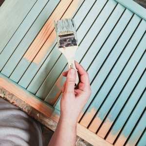

If you recall, last time we used three online color palette generators to help us pull the dominant colors out of our mosaic. Now our job is to pick our favorite choices from those palettes, narrow them down to three main hues, and determine our final colors.
I pulled all three palettes into Paint Shop Pro and chose four of my favorite blues, greens, and pinks to help me narrow it down. Looking at these choices helps me to see what hues will look the most appealing together.

And there is one more option… I can use the color picker in Paint Shop Pro to just grab my favorite colors directly off of the mosaic. As it turns out, this is a good thing, because none of the pinks that the palette generators spit out were the “right” ones. I Sometimes you just have to go with your gut. The image above represents the three colors that appeal to me the most together, and I got them directly from the pictured photos. Despite the fact that we didn’t ultimately go with any of the hues from the palette generators, I don’t consider that a wasted step. Under different circumstances, where I didn’t already have a particular vision of what I wanted before I started, it would have yielded perfectly acceptable results.
So, this is the color scheme I want, but we can’t stop here.

Look carefully at the image above. These tiles represent the Blue color scheme. The tile with the stripes shows the three main colors (plus white) of this scheme. See how dark they are? Nearly all of the canes in this color scheme are much lighter than those stripes. That’s because most of the cane designs don’t use the base colors as-is, but rather mix them in varying proportions to white. If we choose our favorite pink, aqua, and lime colors and use them as-is, the resulting canes will actually be much paler than what we were hoping for. We need to start with darker versions of our favorite colors.

Since I generated these colors in Paint Shop Pro in the first place, I just used PSP to darken them uniformly. These are our base hues for our new color scheme.
Are you getting excited to see these colors translated into clay? You’re in luck – that’s our next step. Start coming up with ideas for how to name this color scheme while you’re waiting. There’s a contest a brewin’!


Hi Lisa, I’ve really enjoyed watching your evolution of a color scheme. Being a confessed color freak, I love anything having to do with color – seeing them, choosing them, combining them. I love the colors you’ve chosen. It’s fascinating how the same colors in different shades give off a different seasonal feel. The first group reminds me of a garden next to a tropical sea with its spring/summery feel. The second group conjures up images of a forest in the fall – evergreens and trees with leaves turning maroon. I’m looking forward to your next step! -Karen
I’m so glad you’re enjoying it! I wanted to do more this weekend, but I don’t have the good camera here at the moment and I want to get nice shots for this.
You are so right about how the brightness of the colors changes the whole “feel” of them. That’s the reason why I darkened them, actually. If I had made my usual repertoire of canes in the original shades, they would have ended up so light by the end that the finished tiles would have taken on more of a “baby’s nursery” feel than a tropical sea.
Of course, this is all theoretical. Won’t it be interesting if I end up with something awful when I’m done? LOL!
Pleased to discover your work through your blog… I have read your articles concerning the evolution of colour scheme, and the way you are doing is very interesting!!! Most of the time I choose the colours I want to work with, and finally the result is quite far from what I first wanted…
(sorry for my poor english … ) –
Thanks to you, I hope I will progress soon!!!
bye bye,
et bises de France!!!